
Part 1: Design as a team
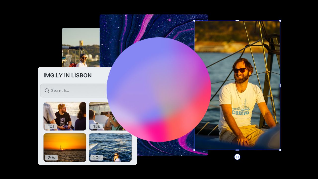
One designer on your team, in outright conviction that the current 2677FD can not be the right choice of blue, changes the color slightly to a more saturated 2676FB, unaware he again forgot to turn off flux. The next day Lisa is infuriated. The color she loved so much now looks terrible on her display. Aziz is furious. He was working on illustrations for the product website, nitpicking the right colors based on the original blue. Oh noes, what a mess…
Heard or seen that before? Bear with me, you´re not alone: Even though we are just a small team of three designers, the journey we had redesigning our product, the PhotoEditor SDK, left us with numerous insights about design collaboration. Most of those lessons were learned the hard way and many of the following suggestions are techniques that matured over the last year. The methods discussed below can be applied to any team, be it two or fifty designers. So, whether your team also struggles with the inability of Sketch to allow for real collaboration or if you’re just curious about how we dealt with the struggle, read on my fellow designer!
Use style guides early on
Right after the first screen is considered finished, sit together as a team of designers and discuss colors (don’t let the developers get wind of it). Schedule the whole thing so you have enough time to get finished while the sun is still out. Otherwise you will look at the interface the next day and have a really hard time reading the ten percent opacity labels.
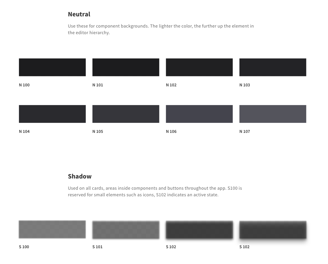
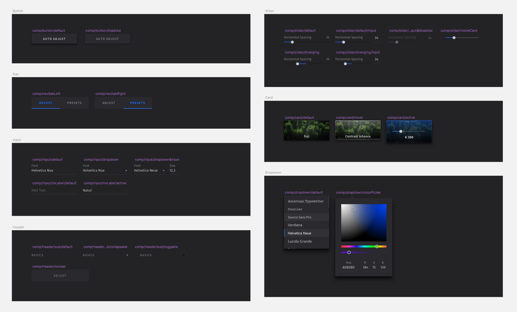
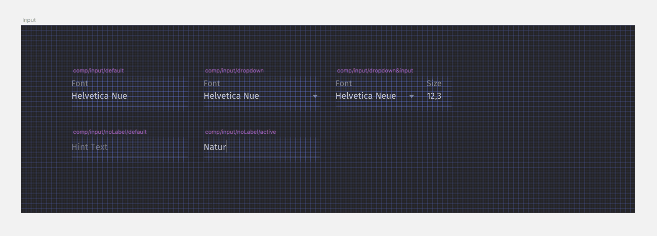
The naming of colors/styles is crucial, they help to communicate with the developers and your fellow designers (we’ll get to that) and keeping a clean state of used styles.
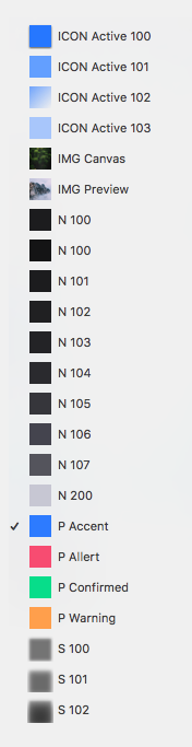
As you can see, naming styles with a predefined set of simple rules, facilitates finding the style you are searching for. Especially since the colors that come into question for the given element are right by your selection. The prefix indicates the type of color: s for shadow, n for neutral, p for primary …
Why start counting at 100? Sketch doesn’t order styles by their absolute value, thus 10 comes before 1. This also gives you the flexibility to define several color ranges for one color type.
If your team defines their neutral colors in a dark spectrum, bright, neutral colors can then be defined as a detached unit by starting from the next hundreds.
Use Grids
I am from a really cozy Bavarian village, miles away from any accumulation of at least 12 houses (at least it felt that way in my youth, where the fastest transport we could use was the new lawn mower from the neighbours). To visit my friends in the next village, walking across an area of meadows, cow shit and finally woodland was the fastest path to take. There was no real pathway so everyone took a slightly different route to uber between the villages, which was just fine during the summer. However, come winter, not so much.
Every year it took us a few weeks, a lot wet socks and thus angry mom’s, to settle for one path. Ultimately, one of us took the courage to create the path of truth by preparing a trail with really tiny steps. By this time the snow usually hit the 30 cm mark.
I encountered a similar situation 10 years later. I started in a team that did give zero fucks about any type of layout or grid. Basically, every member took his own route. Switching out a specific component was often accompanied by the change of multiple components on the project since the perception of equal spacing between each one wasn’t given anymore.
Nowadays, I use grids everywhere, no matter how small the project, alone or in a team — and if you don’t already, I encourage you to start now! It makes it easier to let your creation feel coherent, speeds up the design process and helps any possible future collaborator to navigate trough and comprehend your design philosophy.
Tip: choose an easy to reach shortcut for show grid and show rulers or make a macro to show and hide both (mine is one of the mouse buttons).
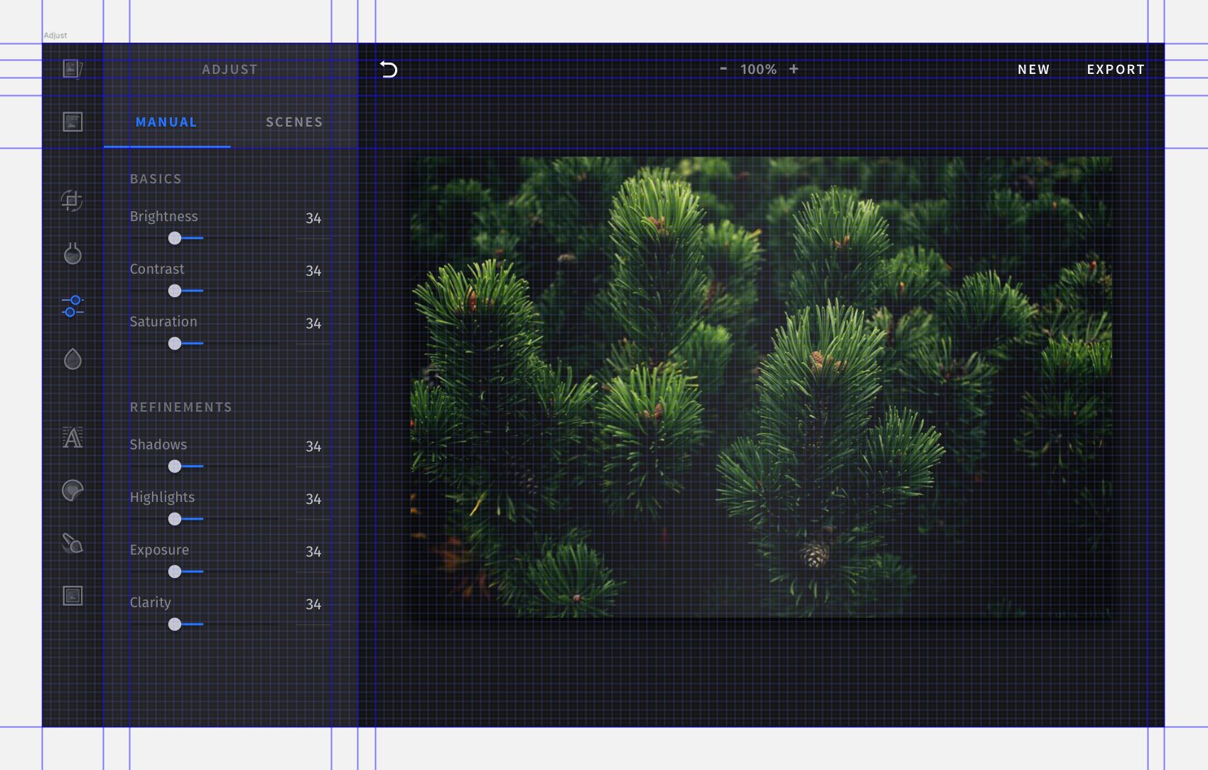
For the photo editor we chose a primary grid of 8pt and a secondary one of 4pt. All components are aligned on the primary grid and fonts on the secondary. Designing isolated components based on the grid helps to keep things evenly spaced, even if components get switched out or rearranged.
We used a lot of different icon dimensions across all platforms (iOS, Android, HTML5), to guarantee a coherent look across them. It was essential to specify a layout and predefined rules for them as well. I will discuss the creation of icons in a future post, where I will also delve into finding a style that is unique and fits your project. So stay tuned!
If you haven’t started yet, create grids from the start on in every component of the project! It will probably get your feet wet at first, but your moms will be happy, I promise.
Keep your symbols organized
Keeping all the components ordered and close to each other is, again, great for consistency. After defining a component once in the page view, you will most likely return to the symbols page for future refinements. Now you can easily compare the component to every other used across the app. It will also make you slightly more liked by developers, something you should strive for as a designer at every time (to increase the chances of your next masonry grid not to get waived off as: “to time consuming to implement in the current release — and the release after”). Framing the cooperation between the two parties as smooth as possible is paramount at all steps of the product cycle.
And also, defining grids on both, the parent artboard and the components. This way pixel imperfections and inconsistencies will be visible immediately.
Also now, all elements inside a component share similar rules about placement and margins. They are easily interchangeable and allow for fast prototyping and iteration even at the final design stage.
One of the hardest things to accomplish while working day in day out on a project like this was keeping everything neatly organized while more and more components were created and added from different parties. In the sprints before an upcoming release, we often were sloppy keeping the symbols page organized, which in turn did cost us a lot of time later on. As a solution, we created a plugin, that lints your symbols page on safe.
What’s next?
The project is far from being finished and we will most likely change things here and there, building upon the methods discussed above. We are on an exciting journey crafting, designing, redefining a creative editor that is already used by hundreds of customers with millions of users. So expect more insights and learnings from our team in future articles!
Thanks for reading! To stay in the loop, subscribe to our Newsletter.